Sony original series · 2024
Ligeramente Diva
Sixty seconds, twenty-five credit cards, one personality.
Sixty seconds, twenty-five credit cards, one personality.
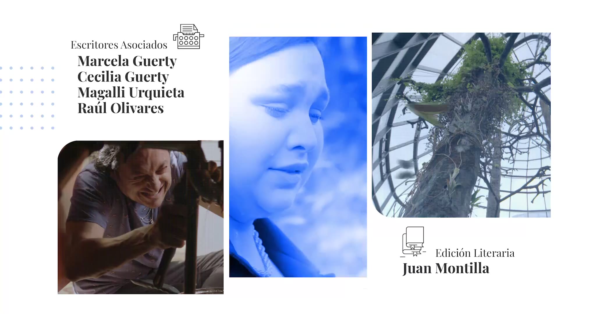
Opening titles for a Sony original series. I created the art direction and every style frame in the sequence — the visual system, the type, and each individual credit card.
The series had a voice before it had a title sequence, and the opening had to match it without imitating it. Sixty seconds to promise the tone — and enough structure to carry a full cast and crew roll without the viewer reaching for the skip button.
The hard part of a main title isn't the first frame, it's the twenty-fourth. Every card has to feel like the same world and still earn its own beat. That's decided once, in the system: how type sits in the frame, what recurs, what is allowed to change.
Cast, writers, music, design, executive production, general direction — each credit gets its own frame, designed and approved before anything moves. Together they are the sequence: read them in order and the title already plays in your head.
The approved frames become the sequence, timed to the track. Nothing is discovered here — it was all decided in the stills.
A title sequence isn't decoration. It's the first promise a show makes to its audience.